Web experience re-design & re-platform.
Telegraph Media Group
In a nutshell.
Challenge.
The Telegraph website was outdated and underpinned by an old technology platform. There was a desktop and separate mobile website which meant there were two sites to manage / maintain.
We were tasked with designing a new, responsive website which would be implemented in conjunction with a re-platforming initiative and the creation of a brand new authoring tool for the journalists.
Approach.
Phased approach whereby sections were redesigned and re-platformed incrementally based on complexity.
Teams started with a short discovery into the problem space followed by delivery cycles.
We iteratively developed a flexible system of templates, patterns & components.
We prototyped throughout the process and carried out regular user research.
We planned at a high level quarterly.
Impact.
A new responsive website designed & built in 12 months (avg. time for our main competitors was close to 3 years) with over 90m global readers.
We delivered a new IA & navigation framework and empowered editorial teams with a flexible system of templates, patterns & components.
Improved collaboration with key stakeholders through co-design & understanding the newsroom.
The team.
At the Telegraph Media Group, cross functional teams worked on the design, build and roll out of sections of the website.
We experimented with different ways of working from designers being embedded in multidisciplinary teams to running UX & Design two week sprints.
Teams started with a short discovery into the problem space to understand the readers, their needs, the content and competitors which informed a range of co-design activities to set the direction for the channel before moving into delivery cycles.
My role.
Shaped the overall programme approach in collaboration with the head of product.
Guided and supported UX designers & prototypers through discovery & delivery cycles.
Hands-on work at key moments throughout the programme.
Facilitated workshops & weekly design crits. Led planning, resource allocation & facilitated retros.
Managed senior stakeholders.
How we did it.
Pragmatic phasing
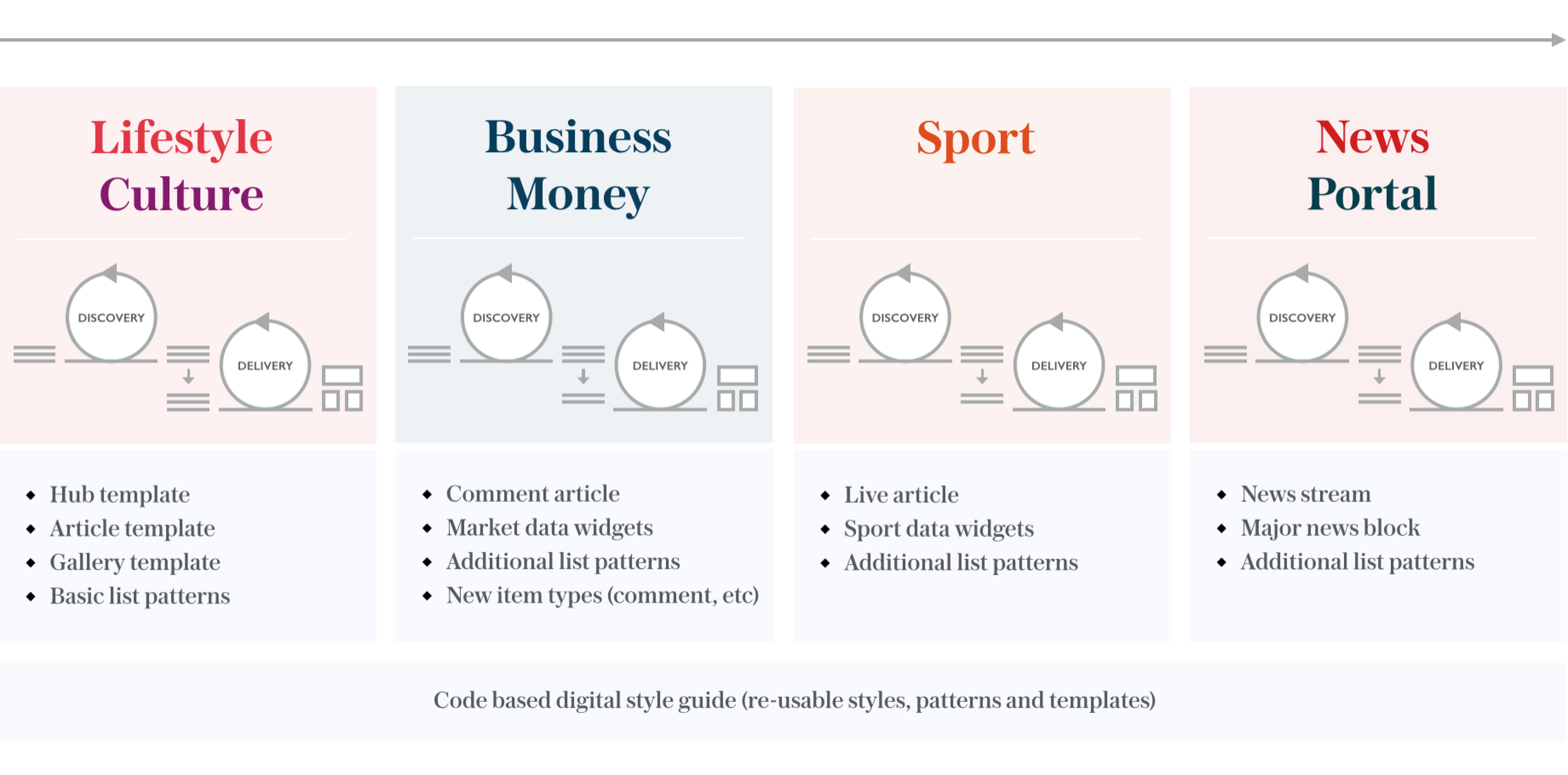
I shaped the overall programme approach in collaboration with our head of product. After exploring the feasibility of various approaches, we decided to re-design and launch sections incrementally. We started with simple sections which didn’t require complex components and templates and built our way up to the large, data rich, high traffic areas like sport and news.
This approach enabled us to demonstrate the value of the team through delivery and collaboration.
The core phases and capabilities
Continuous research and insights
Various forms of research were carried out throughout every stage of the project. From competitor analysis, diary studies, 1:1 interviews to concept and usability testing. We had a rhythm of weekly research coined ‘Testing Tuesday’.
5 core navigation behaviours were identified during research and then considered throughout the design process.
Dip in & out - Short time spent on site (typically single page views), usually from social or search.
Cyclical hub - Anchors to a point if the site (e.g. homepage or channel page) which is used as a hub to explore.
Serendipity - Open to exploration and a voyage of discovery. Not time pressured, often multi tasking.
Linear - Reading to the news on subjects they’re interested in from start to finish (likes a sense of completion).
Multiple lenses - Open and reviews multiple newspaper sites to get a rounded perspective on stories.
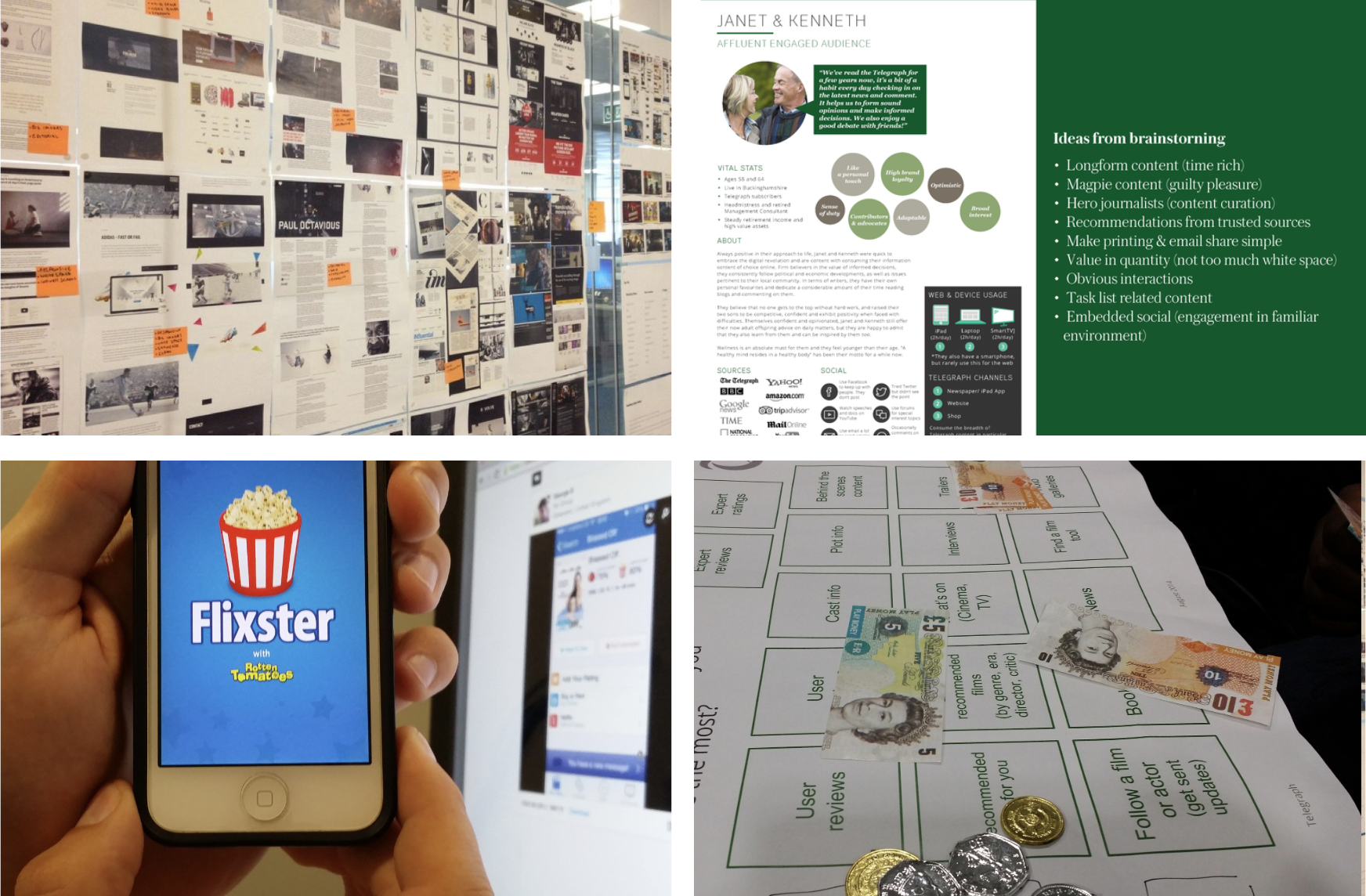
Research activity examples
Rapid discovery & delivery
Short discovery phases were carried out for each key section (Sport, News, Business, etc.) to explore the problem spaces before moving into detailed design phases. Here are some example How Might We’s we explored
How Might We…
create a sense of live sport?
adapt to the rhythm of news?
leverage the lifecycle of a film from rumours through to launch and beyond?
design a flexible framework for different paces and densities of content?
meet the needs of users differing navigation behaviours?
We prototyped throughout the process and developed a prototyping tool which pulled in live content via an API so the content was relative when we were carrying out user research. The tool also had theming so we could quickly switch between different look & feels for the channels.

Discovery examples
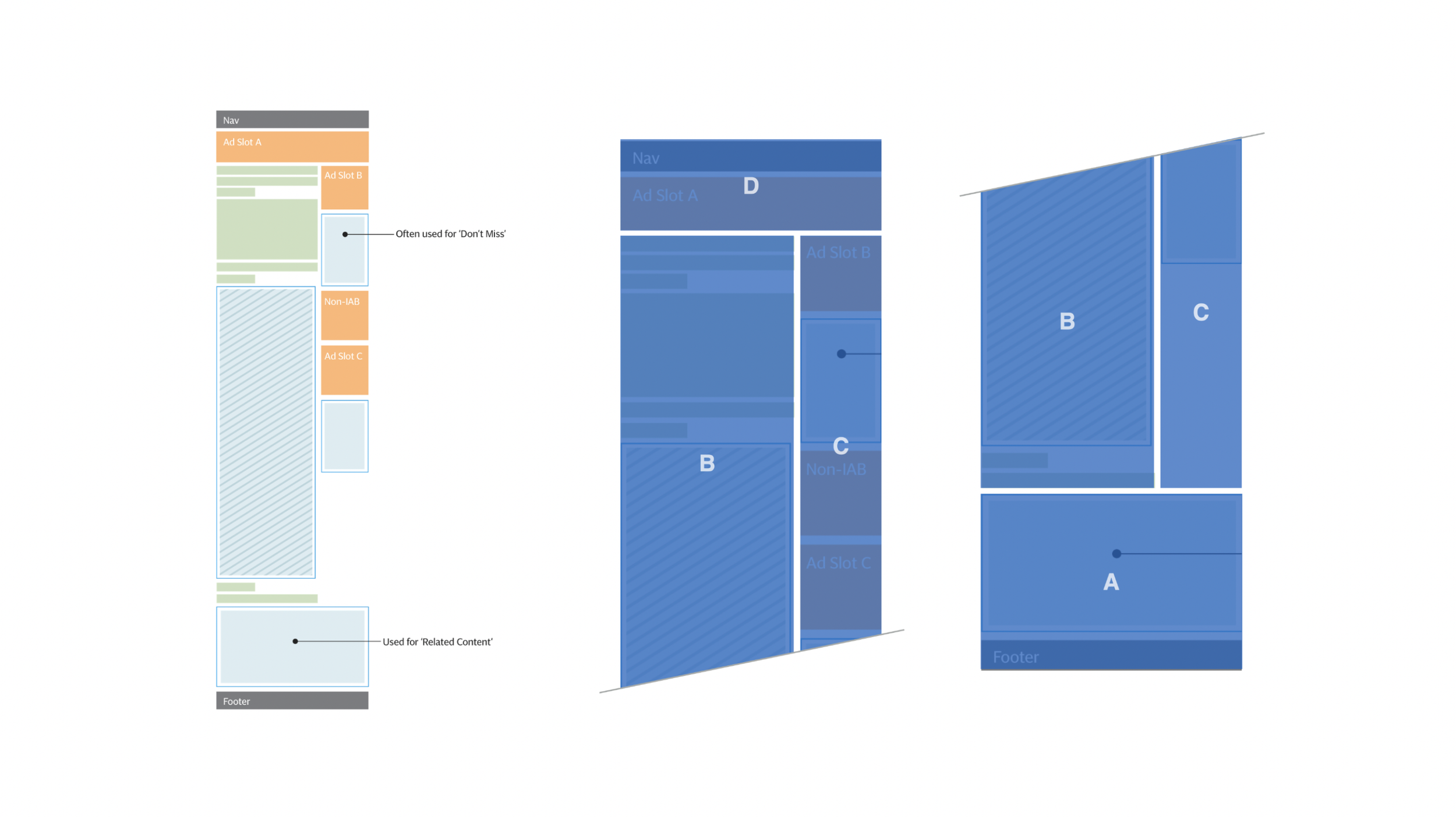
Modular system created.
-
![Template diagrams]()
Flexible templates
A selection of flexible templates were designed, the two most commonly used were the hub and article.
-
![Responding to the news]()
Responding to the news
The amount and pace of content varied vastly across the newsroom, with some desks updating content on their section pages once a day whilst others updated 5-6 times a day. Our components therefore needed to cater for varying types, amounts and paces of content.
-
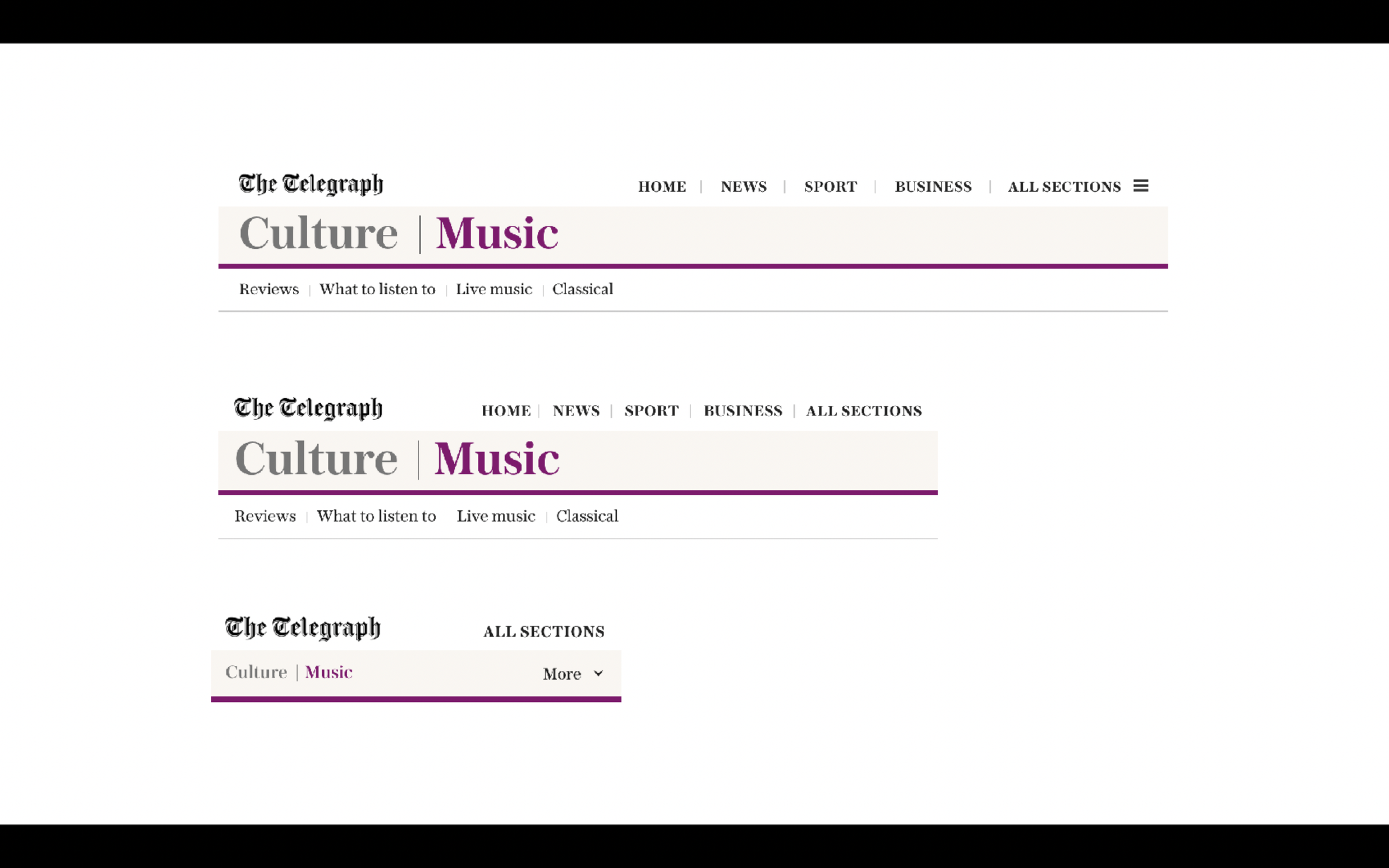
![Navigation framework]()
Navigation framework
The navigation design focuses on the local navigation which inherits the section styling. It features a clear upward path, providing a sense of location encouraging users to explore their areas of interest as well as looking beyond.
-
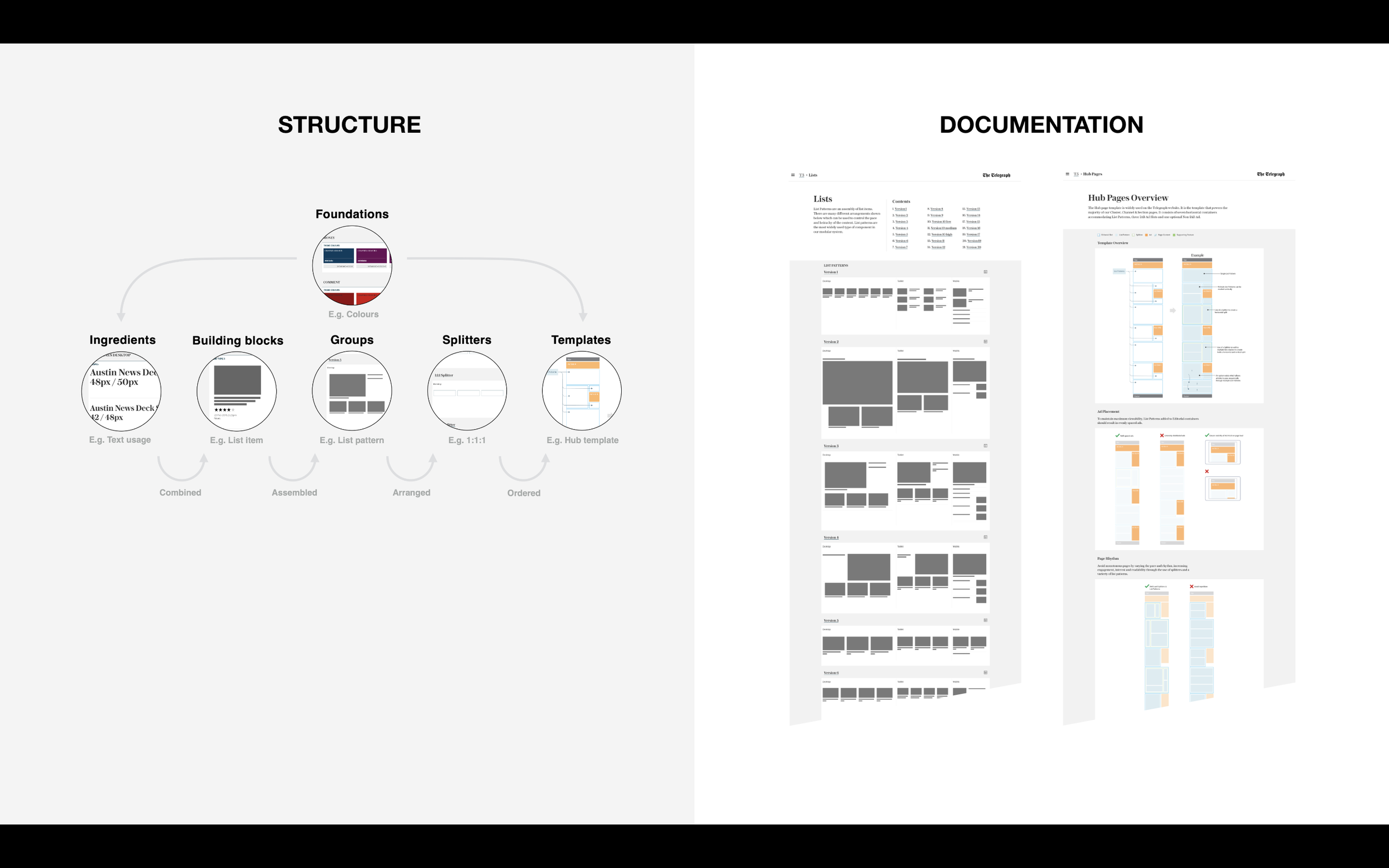
![Style guide structure]()
Driving efficiency through documentation
The style guide promoted awareness and education of the tool kit available as well as encouraging consistency and re-use driving efficiencies.


Improving engagement.
Once the re-design was rolled out, engagement per session needed improving so a cross functional team set out to establish how we could provide readers with opportunities to discover and read more content.
The team approached this with an experimentation mindset, running hypothesis framed A/B & multivariate experiments.
The article template was focused on, experiment zones were defined and ideation run collaboratively which generated a backlog of experiments which were planned and rolled out.
For example, introducing scroll to next article with the ability to choose from several articles increased the average page views per session by over 20%.
Experimentation zones
“It's been an incredible effort by all the teams involved. Our readers can enjoy a smart, modern, clean and engaging new site. And our journalists benefit too, from an infinitely better set of tools. This of course is not the end. We all share the ambition to make the new site even better and even more engaging.”
Chris Evans - Editor at the Telegraph